Friday, 20 May 2011
How to schedule tweets in Hootsuite
Friday, 13 May 2011
GOW 2011 - Act on Opportunity
Taking the time to encourage discussion and planning in your office on how to become more green and carry on your commitment to think about the environment.
Here are today's tips:
1: Utilise the week as a way of implementing changes FOR GOOD and spread the message. Inspire others and have pride in your achievements!
2: Tell colleagues about what they can do to make a difference
3: Publicise your company’s environmental policy, or draw up a simple one if you do not have one (an example is available on the Green Office Week website)
4: Tell suppliers and customers what you are doing and encourage them to do the same
5: Add a strapline to your email sign off to discourage people from printing it.
So, at the end of Green Office Week, what have we learned and what will we be taking away with us? Well, same as least year it has helped to highlight where we could do better in things such as choosing suppliers, making sure everyone is recycling not just the key drivers. So over the coming weeks we will be updating our environmental policy and issuing a reminder to all staff about what can be recycled, saving energy, and only printing when necessary.
Thursday, 12 May 2011
GOW 2011 - Act on Purchasing
It's Day 4 of Green Office Week and today is all about Purchasing.
Today is all about the choices you make when buying new equipment, stationery, even cleaning products for your business. Today's tips are:
1: Buy office equipment with an Energy Star label www.energystar.gov which rates models on their energy efficiency, saving you money and helping the environment.
2: Opt for multifunction IT equipment rather than individual faxes, printers, scanners and copiers
3: Chose a fast boil eco kettle over a conventional appliance.
4: Coordinate your stationery orders to reduce the number of deliveries to your office.
5: Specify recycled products such as paper, envelopes, office furniture and stationery where possible.
BSS is a Konica Minolta dealer* and we have a number of the bizhub multi-function devices in the office that we use for printing, scanning and copying - when we need to. All of the Konica Minolta bizhub devices are built to be energy efficient and carry the Energy Star rating. They also print excellent quality documents, even on recycled paper.
We do watch what we purchase and try to buy recycled or more economical products when we can, make sure toners can be recycled, and take care when choosing suppliers.
* The Document Management Company is one of BSS' divisions, so if you would like to find out more about these lovely machines, have a look at www.thedocumentmanagementcompany.co.uk or call 01792 222 300 to speak to an engineer.
Wednesday, 11 May 2011
GOW 2011 - Act on Waste
This is probably one of the easiest, most practical and used methods for being green in offices, The three R's - Reduce, Reuse & Recycle.
Here are today's tips from the Green Office Week website:
1: Use a bulldog clip to transform scrap paper into bound notepads for internal use or get the local printer to cut and bind some for you.
2: Donate used furniture and computer equipment to charities, youth groups and other local organisations
3: Re use envelopes, jiffy bags and cardboard packaging by over-labeling previous address details
4: Avoid using envelopes with plastic windows which are difficult to recycle
5: Set your printer default to double print using both sides of a sheet of paper
Reduce
We have a policy in place to ensure that only essential documents are printed to keep print wastage to a minimum, and do as much on-screen as we can. Any printing that needs to be done, we make sure is double-sided, where appropriate.
Reuse
Where it is practical to do so, we will re-use packaging such as cardboard boxes and padded envelopes. I have a box under my desk where any waste paper goes, which we form into notebooks for telephone messages or notes and can use for printing.
Recycle
We have a number of recycling points set up around the office to recycle paper & plastic. We also have a an arrangement with a company who collect & recycle any unused hardware.
Tuesday, 10 May 2011
GOW 2011 - Act on Transport
Look around you, do you need all the lights and devices around you on right now?
It's day 2 of Green Office Week, and today we are asked to Act on Transport
Today's tips from the Green Office Week website are:
1: Make conferences and off site events greener by offsetting miles travelled and energy used during the even.
2: Hold a webinar or conference call instead of travelling to a meeting
3: Choose a venue that’s accessible via public transport and provide public transport information to delegates.
4: Set up a car share scheme for people who live close to each other
5: Encourage people to use public transport over cars and taxis where possible – this also cuts down on parking costs and fines!
Personally, I find this one a bit more difficult to tackle. My husband works in the same office as I do and we do come to work in the same car. We also have one or two members of staff who will come to work on their bikes when practical. Unfortunately, it is not especially easy to get to our office, or many of our clients' offices for that matter, by public transport.
However, we do try to cut down on travelling as much as we can, without compromising on our service, and we will use public transport when it is available. As a web and IT services company we have a number of tools at our disposal to be able to offer support and training remotely. We also conduct as much of our business as possible via email and telephone, which reduces mailing and printing costs as well as travel.
Don't forget to follow us on Twitter for more updates.
Monday, 9 May 2011
GOW 2011 - Act on Energy
Act on Energy
We have been monitoring our energy consumption for quite some time as a way of saving money as well as reducing our impact on the environment. It is amazing how much of a difference the little things can make.
For example, instead of automatically turning on every light in the office when we get to work in the morning, only the ones we need are switched on and all the blinds are opened to let the natural light in. As well as saving energy, the light bulbs last longer and everyone feels better seeing some sun....when it's out!
Any computers and equipment that are not needed to run backups or other systems are switched off at the end of the day, and all power saving settings are set where practical.
We all share the same printers via our network to reduce the number of machine we need to have running, and these are only turned on when needed.
We have also made sure that everyone in the office looks at what they are doing to check that equipment is not left on, cables are unplugged when not in use - and I think we've all become a dab hand at making sure we only boil the water we need when making a cuppa, plus making the tea in rounds means the kettle is only boiled once.
Here are some more great tips on staying green at work.
Green Office Week 2011
This week is Green Office Week 2011. We took part last year to help raise awareness among the staff at BSS and our customers and are happy to be involved again this year.
We blogged throughout the week last year and intend to do the same again this year, sharing the changes we are making. If you are also taking part, let us know & check back on this blog to leave your tips.
To find out more & take part yourself, visit http://www.greenofficeweek.eu
Friday, 6 May 2011
How to find a web designer
If you don't have a friend, relative or friend-of-a-friend who's a web designer, you are most likely to find your web designer via one of the following three ways:
1 - Word of mouth:
Ask who friends, colleagues, customers, suppliers have used and what they thought of them. A web designer can look great on screen, but if you can speak to someone who has been through the development process you'll find out a lot more about whether you'll be able to work with a particular designer or company.
You can also ask for recommendations on Twitter & Facebook, but be aware of anyone you don't usually communicate with or spammers who may be paid for recommendations.
2 - Sites they have designed:
If you come across a website you like the look of, find easy to use, or want the same functionality as, try to find out who designed it. Usually there will be a link towards the bottom of the website to the web designer. You should then be able to see more examples of the designers work.
3 - Search engines:
Enter your search term and you are likely to receive millions of results and possibly hundreds of companies to choose from (unless you're looking for something very specific in your web designer). So while you are looking through their portfolios, try some of the checks below and see if this helps to narrow down your options.
- Look at the websites they have designed - not just the pictures, but go and use them. Do you like the look of the sites? Are they easy to use?
- What size are the websites they have developed? Would you be happy they could manage what you need?
- Do all the websites look very similar or would you be happy they could do something different for you? If that's what you want!
- Have they done sites in a similar field to you? If so, they are likely to have done previous research and will have some knowledge of your industry.
- Maybe perform some searches to see how the websites are doing in search engines.
- Have they done sites with similar functionality to what you want?
Next week I'll cover questions to ask your web designer at your meeting.
So, how did you choose your web designer? How many did you get quotes? Did you meet your designer? Let us know your stories below.
Tuesday, 22 March 2011
5 questions to answer before speaking to a web designer
If you do not currently have a website, you may not know where or how to start. This series is intended to help you ask the right questions of your web designer and to give you a bit of a head start for when the designer starts asking you questions.
Part 1 will cover things for you to think about.
1. Why do you want a website?
Have you been told you should have a website or do you have a genuine need for one?
If you’re doing it because you’ve been told you need one, the chances are you won’t buy into it, and a website does require some investment from you. Not just in terms of cash, but time and thought too.
Aside from that, what specifically do you want your website to do for you? Some examples are to:
· increase enquiries online and offline
· sell your product online direct to the retail or wholesale sectors
· provide company information to save costs printing brochures & leaflets
· manage customer support and improve customer communications
· launch a new product, service or brand
· provide information to clients or potential clients
Knowing what your website needs to achieve makes a big difference to how the website is designed and built.
2. Who is your audience and what do they want?
This could be one of the most difficult questions, but can give you the most benefit. Think about who the website is targeting and put yourself in their shoes. Remember that your primary aim and your visitors’ aims could be very different. If you are trying to sell a product, they may just be looking for information – the website is there to convince them to buy.
In the example above, if you want to sell your products and a visitor is likely to be looking for information it makes sense to make sure you have enough information available so that the potential customer feels satisfied, and may purchase online or has the information they need to purchase offline.
3. What content will the site include and how much?
Ideally, you should think about this from 2 points. The launch - how much content do you want to start with? Then a few weeks, months or years down the line - how much could your website grow? Again, this will vary depending on the answer to point 1. A company brochure site is likely to stay fairly static, whereas an e-commerce site or information site could start small and expand rapidly.
Think about the type of content too. Will there be video? PDF documents to download? Or will it be mainly text?
4. What functionality do you need from your site?
Do you want to be able to update the website yourself? Which content will you need to update?
Do you wan visitors to fill in forms online?
Will you have online payments? Or full e-commerce functionality?
The possibilities are endless, and you do not need necessarily need to have a complete features list written down, but thinking about the kind of thing you want your website to do will help your designed lead you in the right direction.
5. How do you want the website to look?
Design is subjective and open to countless possibilities, so while some designers love to be given a complete carte blanche when it comes to web design, it is often better to have some ideas of what you want.
As an example, we designed a website for a client. It was very dark, with greys and blacks, that made their orange logo & branding really stand out. The client hated it because they wanted a white, very light design – which unfortunately they hadn’t mentioned!
More often than not it can be what you don’t like that can be more helpful than what you do. Do if there’s a particular colour or type of image you don’t like, or you don’t like your menu on the left hand side of the screen, you don’t like a very minimal website – tell your designer!
Now you’ve hopefully thought about what you want from your website and have some notes to talk to your web designer about. In part two we’ll look at questions to ask your web designer.
Friday, 11 March 2011
How to...link to your Facebook page
The Find us on Facebook button

Essentially the button was a marketing tool provided by Facebook to enable you to link to your page and you needed to know how to add an image & a link to your website for it to work. This is still the case and, as far as I am aware, you can still use the button if this is your preferred method of linking.
Another popular choice, if you use a number of social networking sites, is to line up a few icons and add a different link to each of them. There are plenty of people offering free icons for download for every site you can think of! A search for 'free social networking icons' will give you plenty of options. Or you can design your own to match in with the theme of your website.
The icons above were found on the following sites:
1, 4 & 5: http://blueblots.com
2: http://tydlinka.deviantart.com
3: http://www.blog.spoongraphics.co.uk/
There's also a wide variety of Facebook icons on www.facebookicons.net.
Facebook has made a few pages to enable you to link from your website to your page. We have covered adding a Facebook 'Like' box in a previous post, and another option you have is to add a badge.
If you follow the tutorial above, get to step 3 and instead of 'Add a Like box to your website' click 'Get a Badge'.
on the left hand side you have a number of options to choose from - Profile badges, Like badges, Photo badges and Page badges. Click on Page badges (if you aren't already on the right page).
To see how you can change the badge, click on the 'Edit this badge' to the right hand side to see the options available. Then just copy the code and add it to your website (or send it to your web developer).
This is just a very quick overview of the options available to you with the new Facebook pages, so if you'd like any more details or have anything else to suggest please comment and let us know.
Friday, 18 February 2011
How to....add your business to Google Places
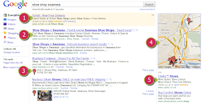
(1) & (5) are paid for ads. You'll notice that (1) is in a slightly shaded box and that both tell you they are 'Ads'.
(2) is a natural or organic search listing, so these people are there thanks to SEO.
(3) are the results based on Google Places and conincide with the map (4) to show you physically where, in this case, each shoe shop is located. These results are not based purely on your location and you still need to optimise your website to ensure you're placed towards the top.
However, as the Google Places results often appear above many of the natural listings and take up most of the first page of results, if you rely on local searches and haven't added your business now is the time to do it!
In the example below, we’ll set up a cake making business in Swansea.
Step 1
In your web browser go to http://www.google.co.uk/places, if you have a Google account sign in. If you don’t yet have a Google account click on the ‘Sign up now’ link.
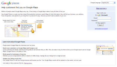 (If you already have a Google account, skip ahead to Step 2.)
All you need to set up an account is an email address. Enter your details and follow the on-screen instructions. You will need to validate your email address in order to continue.
When you validate your email address you should get the following message:
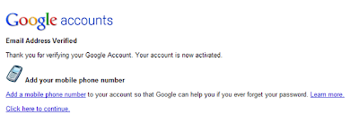 Use the 'Click here to continue' link and you should be directed back to the Google places page.
Step 2
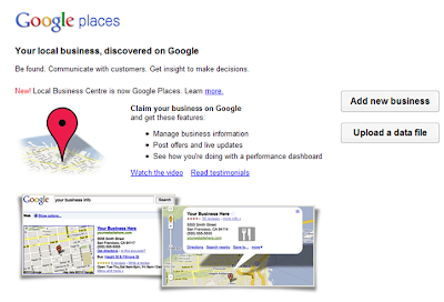 Click 'Add new business' to get started, then on the next screen add your phone number and click 'Find business information'.
 If your business is already on Google Maps, you'll see a message similar to this:
 If this is your business, you can claim the listing by clicking 'edit'. If it is not your listing, click 'Add a new listing' to enter your details.
If you are setting up a new busines, it is unlikely that Google will have any data about your business, so you will get the following screen for you to input all of your information.
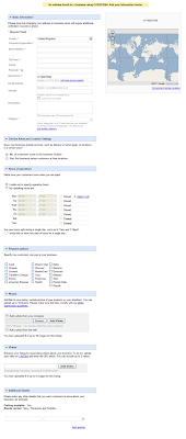 As you enter your details you'll notice the map on the right hand side move down the screen with you and update to match your details, see example below:
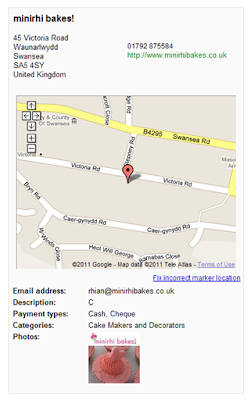 When you are happy, click the 'Submit' button.
Step 3
In order to publish the listing you need to validate it. At the moment Google offers validation by postcard, which unfortunately can take a few weeks!
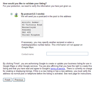
Click Finish & you'll get the following message:
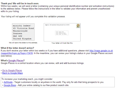
Within the next two weeks you should recieve a letter with your validation code. When you receive this, log in to your Google Places account and enter the PIN where indicated.
I'll update this post with further details when our validation letter arrives!
Wednesday, 2 February 2011
MODx Revolution Tutorial for beginners – Part 3 - Your first MODx site
Ok, so in the last tutorial, we had a nice introduction to the MODx manager, looked at some important System Settings, had a quick look into Templates, and installed our first add-on.
Today, I’m going to look a little further into Templates, and actually build a new site (based on a free CSS Template).
Building Sites with MODx
In most cases, you’ll design you site in Photoshop, or your graphics program of choice, slice up all the images, then start coding it with squeaky clean XHTML and CSS. Or at least, that’s what we do! One of the nice things about MODx is that it’s incredibly flexible. You can build a site almost completely static, with just a few little MODx features used, or you can go the whole way, producing a dynamic website jam-packed with interactivity and space dust.
By using a CSS template, I can show you how to get your site up and running once you’ve coded it, then add in all those nice MODx features afterwards. The template I’m going to use can be found here. This template contains several different features that lend themselves well to a MODx site, like a site search, recent posts, recent comments, tags, categories and archives.
So after unzipping the template, I can see that it has an index file, folder for the images and a CSS file. These are the only files we’ll need to get the site up and running.

File Upload
So we want to transfer the images into our MODx installation. There are a few different ways that we can do this with MODx Revolution. We could either use an FTP client and simply drag the folders into the “assets/images” folder, or we can use the new file upload feature of MODx Revolution. Seeing as we’re here to learn, let’s do it the MODx way!
In your Manager, click on the Files tab. In the top right-hand corner, you’ll see a little blue and white icon.
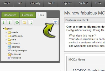
This is your MODx Browser! A quick and easy way to see all of the files associated with your installation of MODx. So click on the icon, and your MODx Browser will open up, overlaying the manager screen.
On the left, you’ll see a number of folders. If you go into assets, then click on images, you’ll see all of the files in that folder on the right. Don’t have any images? Good. Me neither. We’re about to sort that out.
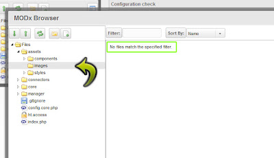
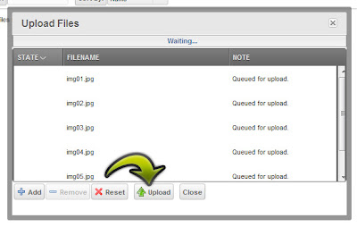
Click on the small icon that’s furthest right out of all the icons above the document tree on the left. This will open up the MODx file upload facility. When the file upload box has appeared, click the ‘Add’ button, and browse to the images in the free template.
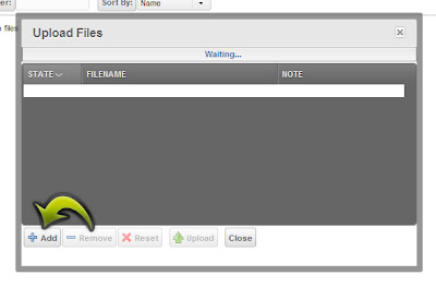
Once you’ve selected all of them, you should see them all listed, ‘Queued for upload’. Then just click Upload, and you’re done. You should now see all of your images in your images folder.
So that’s the images done, let’s just get the CSS and pop that into our styles.css file. We already linked up our index file and our CSS in the last tutorial, so it makes sense just to copy the template CSS, and paste it into our CSS file. Once you’ve copied the CSS from the template file, you can use the MODx text editor to paste it into. One thing to note here is that the image paths shown in the Template CSS file are slightly different to what we’re going to need, so we need to amend them slightly. Instead of having ‘images/image_name.jpg’, we’ll need to change them to ‘../images/image-name.jpg’. Once that’s done, we’ll go and make the final change to the template.
Template editing
Open up your BaseTemplate (under the Elements tab, and then inside the Templates folder) and copy the contents of the index file from the template file. Paste all of this over whatever you already have in your BaseTemplate. If you hit Save, and refresh your website in a browser, you’ll see that we have a load of ugly, un-styled content. We need to adjust the path to our CSS file in our BaseTemplate.
The line that reads:
<link href="default.css" rel="stylesheet" type="text/css" media="screen">
Needs to be altered to:
<link href="assets/styles/styles.css" rel="stylesheet" type="text/css" media="screen">
Refresh your site now, and you should see something pretty similar to the template we downloaded.
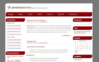
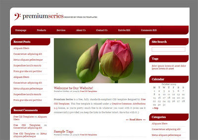
Update the image path of the flowery image in your BaseTemplate, and you’ll be done.
CodeMirror
Going off on a little tangent, I just want to introduce this fantastic add-on. Its best to get this in now, because it can really help you while you’re building your site.
The add-on is called CodeMirror. It makes the MODx text-editors much more user-friendly from a coding point of view. You can download it from Package Management (Remember when we installed TinyMCE in the last tutorial??) and it can be found in MODx Add-ons > RichTextEditors. Once you’ve downloaded and installed it, you’ll notice that your BaseTemplate now has text highlighting and line numbers. It may be small, but it’s much easier to manage all of your coding inside MODx with this add-on.
MODx-ing your template
Now, we’ve essentially got a one page static site, with all of the code being stored in our BaseTemplate. But we’re using MODx, so we should take advantage of some MODx tags to help us along the way.
In all honesty, the coding shown in the BaseTemplate (that we got from our free template) is a little outdated. I’m going to update it, and add a few MODx tags in one sweep.
The current head tag looks like:
<meta equiv="content-type" content="text/html; charset=utf-8">

<title>Premium Series by Free CSS Templates</title>

<meta name="keywords" content="">

<meta name="Premium Series" content="">

<link href="assets/styles/styles.css" rel="stylesheet" type="text/css" media="screen">
I’ve changed mine so it reads:
<meta charset="[[++modx_charset]]">

<base href="[[++site_url]]">


<title>[[++site_name]] | [[*pagetitle]]</title>


<meta name="description" content="[[*description]]">

<meta name="keywords" content="">


<link href="assets/styles/styles.css" rel="stylesheet" type="text/css" media="screen">
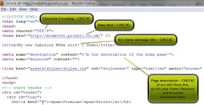
Apart from adding a few MODx tags, I’ve added an HTML5 DOCTYPE, a base href tag and a meta description tag. This keeps things nice and up to date. We’ve also removed some of the bits that aren’t required when a HTML5 DOCTYPE is declared.
So let’s just take a look at each of the MODx tag and explain what they’re doing:
[[++modx_charset]] – This is the character encoding that is used for your site. You selected it during installation. MODx primarily works with UTF-8.
[[++site_url]] – This is the URL of your site and was determined when you installed the site.
[[++site_name]] – This is the name of your site, as specified in the System Settings.
[[*pagetitle]] – This is the title of each of your resources. The only one we have at the moment has the title of ‘Home’.
[[*description]] – Again, this is specified in your resources. This tag is very handy for the SEO of your site as generally, the content of the description tag is shown in the Google search results (other search engines are available!)
So if you now Save your BaseTemplate, and refresh the website, you won’t see too much change, but if you view the source, you’ll be able to see exactly what we’ve done.
Summary
In the next tutorial, we’ll look further into Chunks, and why they’re so cool.
If you have anything to say about this tutorial, or how it could be improved please feel free to leave a comment.
If you need help with a MODx website, why not give us a call or get in touch?
Friday, 21 January 2011
How to....Add a Facebook 'Like Us' Box to your Website
Today I'm going to show you how to add a 'Like Us' bos for your Facebook page to your website. It's a bit of an update from our 'How to add a Find us on Facebook button' post.
Step 1: Go to your business page on Facebook.
(If you haven't already got one, see our guide on how to create a Facebook page for your business.)
Click the button labeled 'Edit Page' in the top right hand corner of the page.
 |
| Screenshot of Picseli's Facebook page |
Step 2: Click on the Marketing link
From the menu on the left hand side, click on the 'Marketing' link.
Step 3: Get the box
Here you will see a list of the options available to help you market your Facebook page & get more 'likers'.
Step 4: Customise your box
On this page you'll see an example box that you can customise to suit your company.
As you make changes to this little form you should see the example box on the right update to reflect your changes.
- Facebook Page URL: In this box you need to enter the URL or web address of your facebook page. In our case it is http://www.facebook.com/picseli.
(If you don't have a customised or vanity URL yet, then you'll need to open up another browser window or tab, so you don't lose your current place, and navigate to yoru Facebook page. Then in the address bar at the top of the browser copy the whole text that appears starting with http://www.facebook.com/....., then paste this into the Facebook Page URL box.)
- Width: If you have a special place for your Facebook box to go, you'll know how wide it needs to be, so enter this width - in pixels - in this box.
- Colour Scheme: You can either have 'Light' (which leaves it white) or 'Dark' (which turns it black), so select dark, see what you think and make your decision. For Picseli, we'll be leaving it as Light.
- Show Faces: If you untick this option, you won't see the icons or avatars of the people who currently like your page.
- Stream: If you untick this option you will be left with just the people who like your page, not the latest posts to your page.
- Show Header: Untick this if you don't want the 'Find us on Facebook' banner at the top of the box.
So you can make your box as complicated or as simple as you like, showing your latest posts and 'likers' - as we have done in the right hand bar on this blog - or just have a simple 'Your Company on Facebook' link, as in the image below.
When you're happy with your box, select the 'Get Code' button.
Step 5: Display on your website
You'll get a pop up box with 2 code options, so copy whichever one suits you best (or copy both & send them to your web developer) and add them to a suitable place on your website or blog.
And there you have it, visitors can Like your Facebook page from the comfort of your own blog. Hope it helps!
P.S If you do enjoy these posts, please do come and like us on Facebook - don't foget to say Hi!
Wednesday, 19 January 2011
MODx Revolution Tutorial for beginners – Part 2
Ok, so following on from Part 1 of this guide, you should have your install of MODx Revolution up and running! If you use your username and password that you selected during the installation process, you’ll be able to login and see the MODx manager administration screen. Pretty, isn’t it?
With MODx Revolution, you start from a completely clean slate. If you’ve used MODx Evolution before, you’ll notice that there is no pre-installed site template, or content, or extras. All you get is a very basic template which just outlines the default HTML tags, and a single resource with no content in it. For me, this is a big plus for Revolution. I don’t have to go in and remove a load of bits I don’t want to use. I can just fetch add-ons when I want them.
Site Configuration
There are lots and lots of different ways you can configure MODx from the Manager. You’ll need to use the System Settings at various times throughout a project, so it’s probably wise to have a quick look into how it all works before we get started on anything too serious!
So, in the Manager, hover your cursor over ‘System’ and select ‘System Settings’ from the drop down menu. You’ll then be taken to the System Settings screen where you can set general preferences and configuration settings for the MODx manager interface, as well as how your MODx site runs.
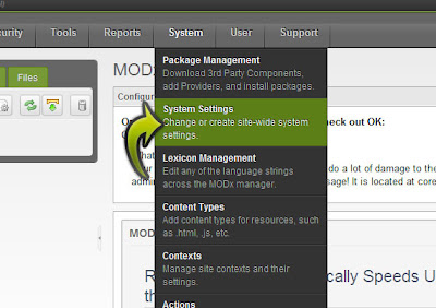
Feel free to have a good look through all of the different options you can change here. There is a ‘Filter by area’ drop down where you can choose to look at settings associated with a certain area (Friendly URLs for example), a text search where you can simply type in the name of the setting you’re looking for, or a drop down where you can look at settings for some of your add-ons (don’t worry, you shouldn’t have any yet and by default, this option is set to ‘core’. You can also create your own settings, but that’s definitely for another day!
What I want to alter now is the name of your site. In your default template, the name of your site is currently being used in the title tag. In most cases, this would be the name of the company who’s website you’re building, or your name if it’s a personal site. To find the setting we want to change, use the ‘filter by area’ drop down menu, and select ‘Site’.
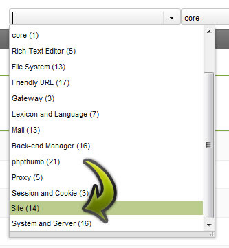
Your settings should change, and if you look half way down the list you’ll see a setting entitled “Site Name”. Double-click on the default Site Name (it will probably read ‘MODx Revolution’) and alter it to whatever you like. I’ve changed mine to “My new fabulous MODx site!”.
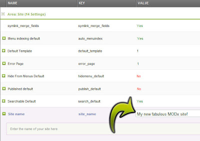
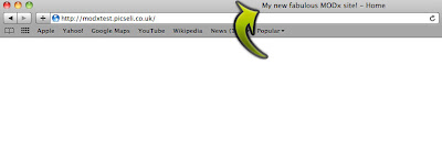
Hit the enter key, and you’re done. Easy eh? There’s no need to hit a save, or submit button, as soon as you’ve amended the setting and hit enter, you’re done. Now, if you go to another browser tab or window, and load up the front end of your site, you should see that the title of your page has changed to the Site Name you just entered. Have a look at the Source too. This will show you that the new Site Name has been placed inside the title tag. Now I’ll show you why it’s appeared there.
A quick intro to Templates
If you go back into your Manager, on the left-hand side you’ll see a box with three tabs called Resources, Elements and Files. We’ll be using Resources more in the next part, so for now, click on Elements. You’ll see a list of categories, all with different icons. Now don’t be afraid, you’ll learn what all of these are, and what they do throughout this series of tutorials. The one we’ll use for now is Templates. If you click the small arrow next to Templates, it should open and you’ll see one little file underneath it called ‘BaseTemplate’. This is the simple template that you’re provided with when you download MODx Revolution.
As the name suggests, templates provide your site with structure. You can apply a different template for every single page on your site if you wish, or, more likely, you’ll have just a few different templates ensuring that your site has the same look and feel throughout.
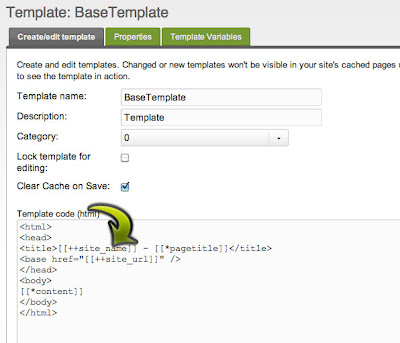
If you look at the code in the template, inside the title tag you’ll see an odd looking piece of code that looks something like [[++site_name]]. Yep, you guessed it, this is your Site Name! That specific syntax ([[++something_or_other]]) is used for MODx system settings. More about that later.
Installing Add-ons
So I think so far we’ve established that MODx Revolution is incredibly cool. Well, we’re just getting started, so be prepared for way more coolness. We can raise the cool factor tenfold by installing add-ons for our site.
Add-ons help us to perform tasks within MODx that make it much more dynamic. There are lots of different add-ons, way too many to go into, and the amount is growing on a daily basis. In MODx Evolution, some of the more popular add-ons were pre-installed, and to get others, you had to go to the MODx website, download the files, upload them to your site via FTP or copy and paste the code into a new snippet. Either way, it wasn’t ideal, and this has been addressed in MODx Revolution, where you can download and install add-ons within the manager. Brilliance!
One add-on that you’re likely to want to install (especially if you’re going to be handing the site over to somebody not code-savvy at some point) is TinyMCE. TinyMCE is a rich text editor, meaning we don’t have to delve through the code to add paragraphs, headings, images etc.
So, hover over ‘System’, and then select ‘Package Management’ (catchy eh?!).
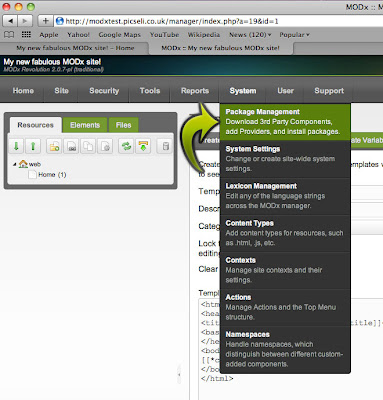
You’ll see two buttons, one called ‘Add new package’ and the other called ‘Download Extras’.

Click on ‘Download Extras’, and you’ll see a dialog screen. This is another place that you’ll become very familiar with if you’re building MODx sites with some degree of complexity, so before we download anything, feel free to have a little look around to see what’s on offer.
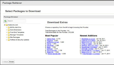
There are a series of different categories on the left. A nice little explanation of these is given for each of these on the Codingpad, but for those too lazy to click a link, it is as follows:
- MODx Addons – these are functional bits and pieces that are not part of the MODx core, such as galleries, menu builders, tagging snippets, etc. They do not change the core but simply add functionality.
- Core Extensions – These are additions to the core itself that change how MODx works. They affect how parts of the core work.
- FrontEnd Templates – These are ready made templates that are packaged for an easy install and setup. If you don’t want to build/port your own template you can grab one of these and play with them, use them as they are, or modify them to suit your needs.
- Manager Templates – These are backend templates to change the look of your manager. These will affect just the look, not the functioning, of your manager.
- Site Packages – These are prebuilt complete sites that you can install and explore. This is great if you just want to demo MODx and see how it works. A prebuilt site like this can also be a great learning tool as you can explore the backend and learn how different things are implemented.
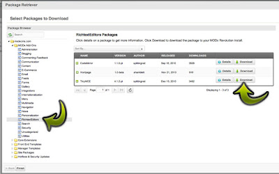
By clicking the small arrow next to ‘MODx Add-ons’, you’ll see the categories within it drop down. Select ‘Rich Text Editors’ from the list, and you’ll see the items on the right change. The one we want is TinyMCE, so click on the ‘Download’ button that corresponds with it, wait until that button changes to read ‘Downloaded’ and then click ‘Finish’ in the bottom left.
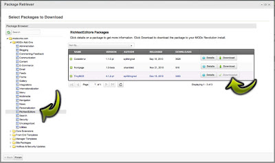
You’ll now see that TinyMCE has been listed, ready to be installed! Click on the install button, follow through the steps shown, and then you’re done.

If you go to the ‘Resources’ tab in the box on the left (next to ‘Elements’) and click on your ‘home’ resource, you’ll see that you’ve got a nice text editor thats been added to your main content area. Thats TinyMCE!
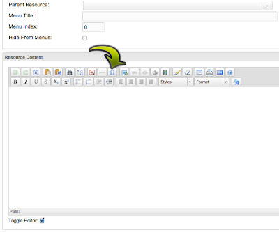
I think that’ll do for now. In the next post, we’ll go through templating, creating some pages for your site, and possibly investigate some of the other add-ons that are available.
If you have any comments about this tutorial, useful additions, corrections or whatever, please leave a comment.
Thank for reading!
.jpg)


